Category
Balance
A nutrition app designed around the menstrual cycle, not the other way around.

Problem
Process
Using a Design Thinking approach, I moved from research to high-fidelity prototype across five structured phases, ensuring every design decision was grounded in real user needs.
Result
The result is Balance: an app that connects personalised nutrition with cycle tracking, helping women eat in tune with their body.
Key Research Insights
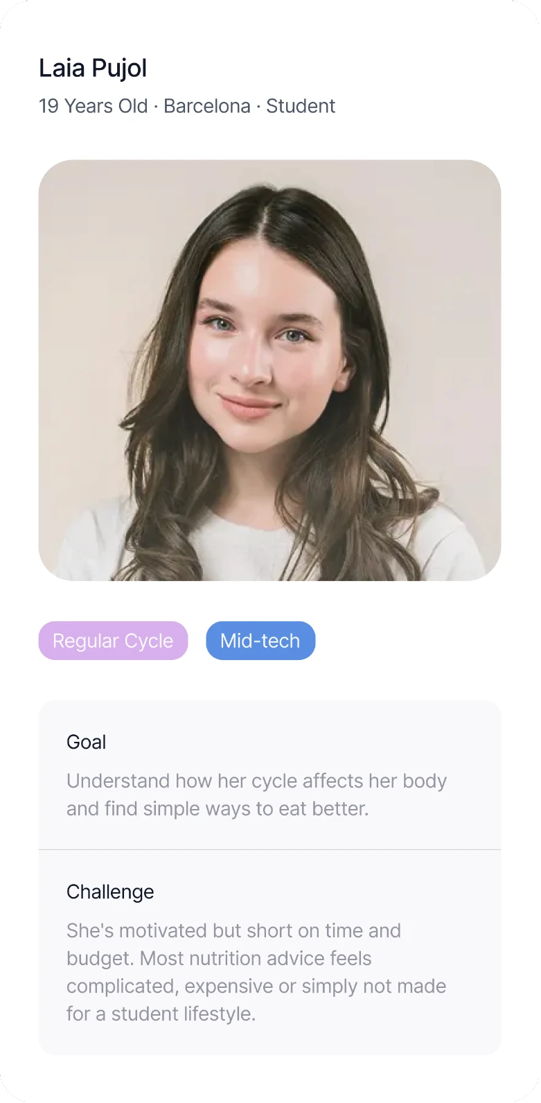
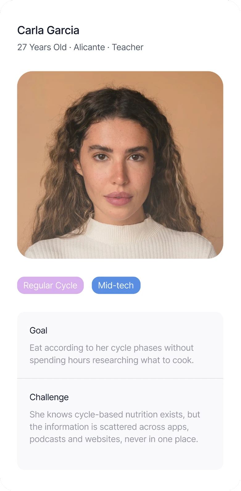
Three findings shaped every design decision, drawn from a contextual survey, a benchmarking analysis of existing health apps and synthesised through an affinity map:
Users had little knowledge about cycle-based nutrition, but showed strong interest in a simple, flexible tool. Time and motivation to cook were major barriers, pointing to the need for an accessible, educational experience. And no existing app combined cycle tracking with nutrition in one place, forcing users to juggle multiple tools.




Brand Identity
The identity is built around the values of well-being and inclusivity.
The icon accompanying the Balance wordmark represents the different phases of the menstrual cycle while symbolising balance, continuity and cyclical movement.

Key Design Decisions
Every design decision is based on one principle: nutrition built around the menstrual cycle, placed at the centre of the experience.
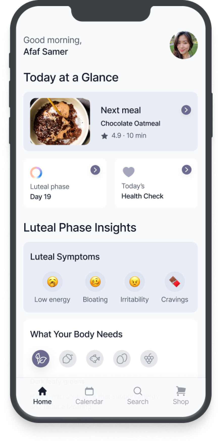
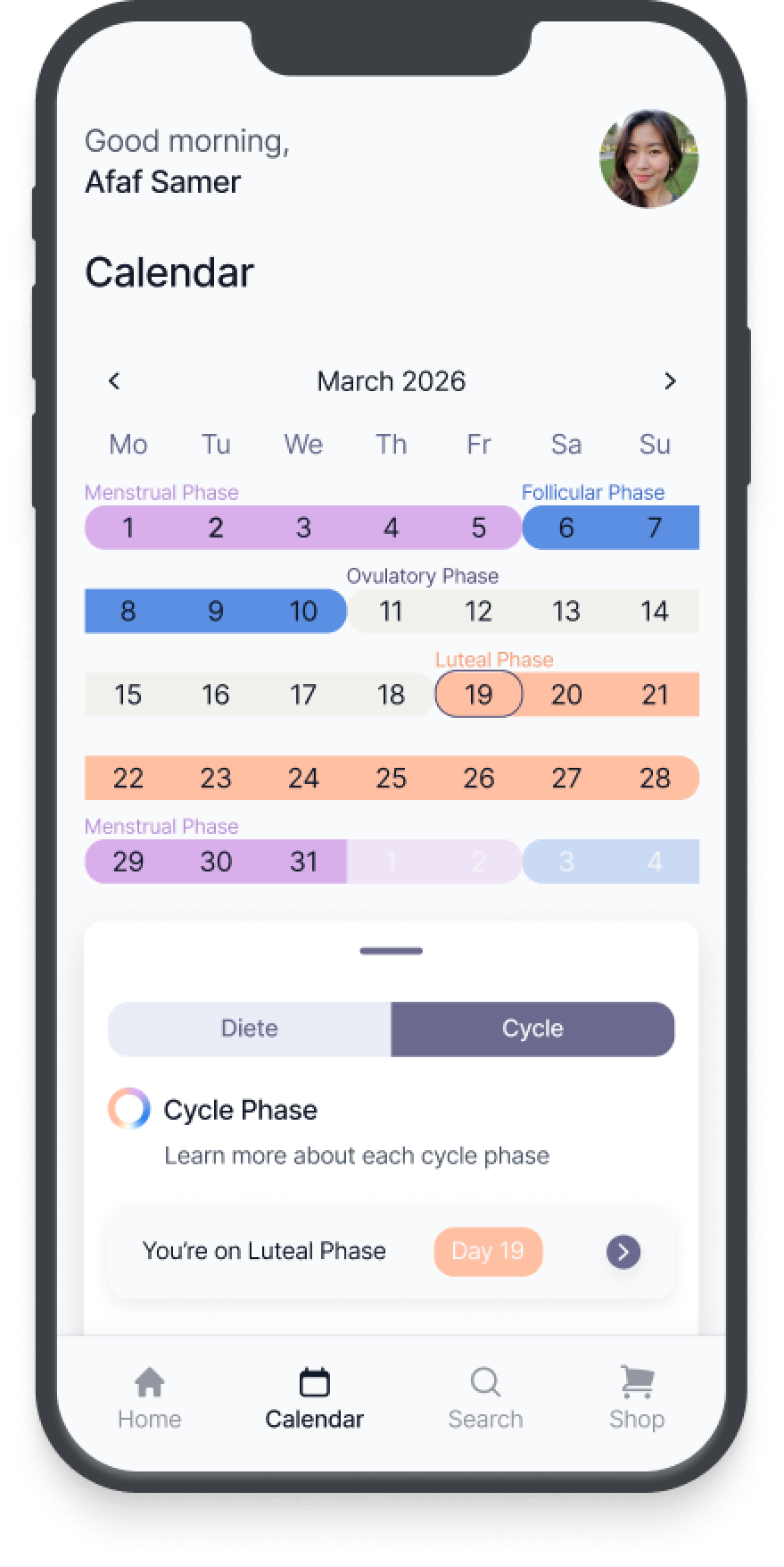
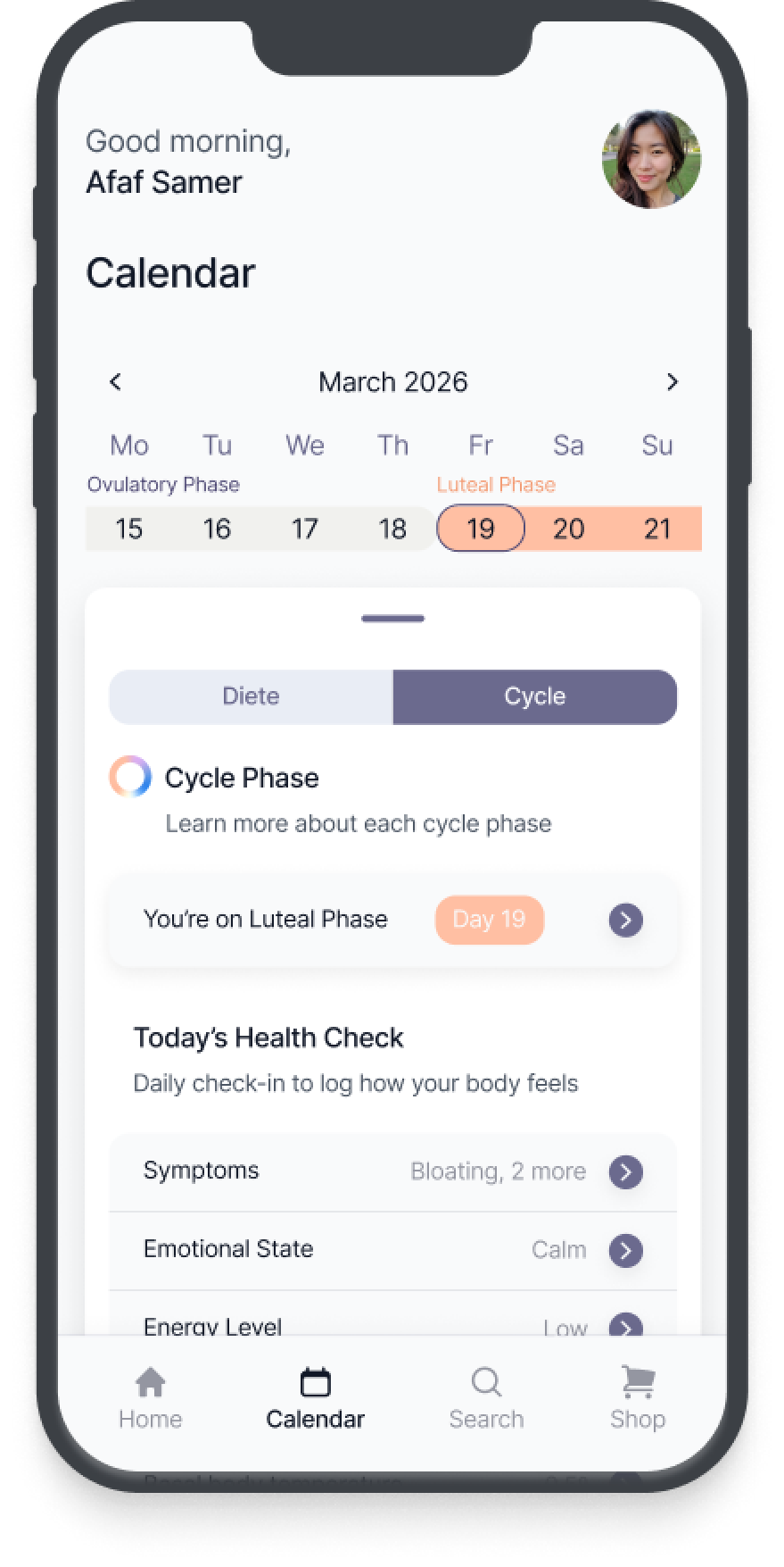
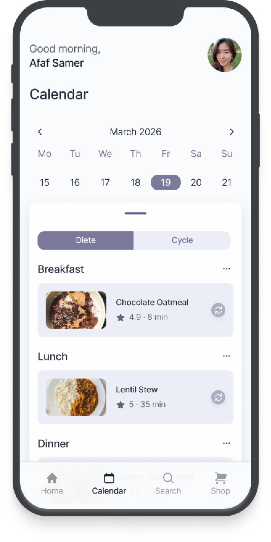
Diet and cycle tracking exist as two connected views, meal suggestions adapt automatically to the user's current cycle phase. This same logic shaped how I designed the recipes, as a multi-format experience combining video, visual steps and ingredients, to lower the barrier for users with little time or motivation to cook.
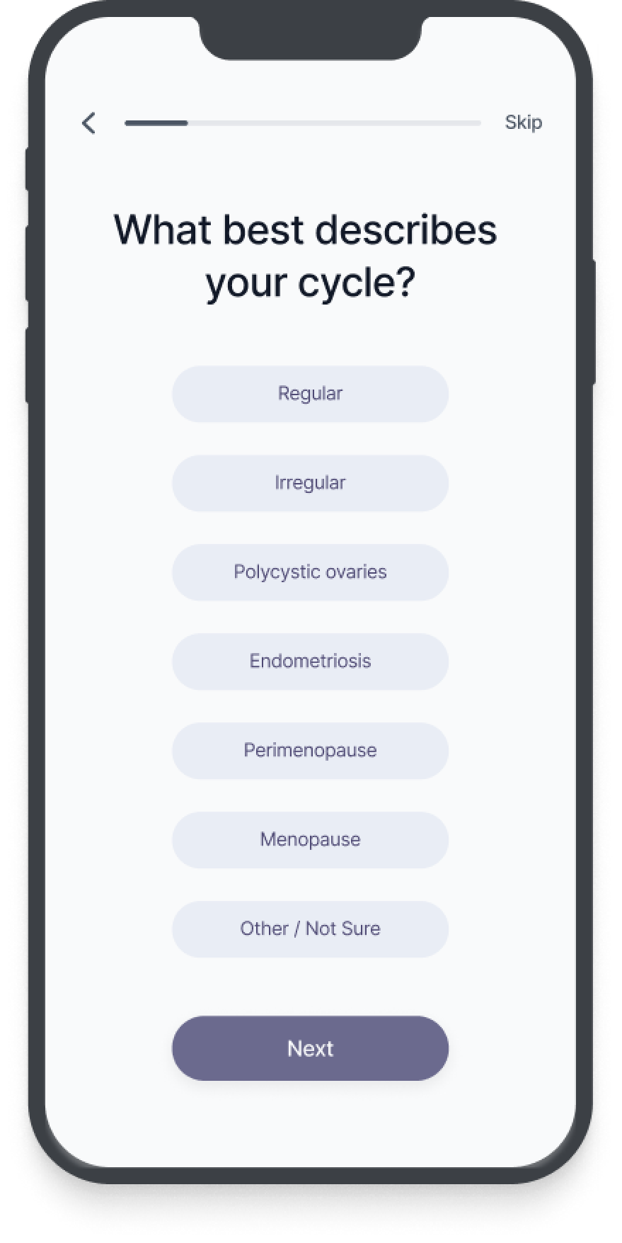
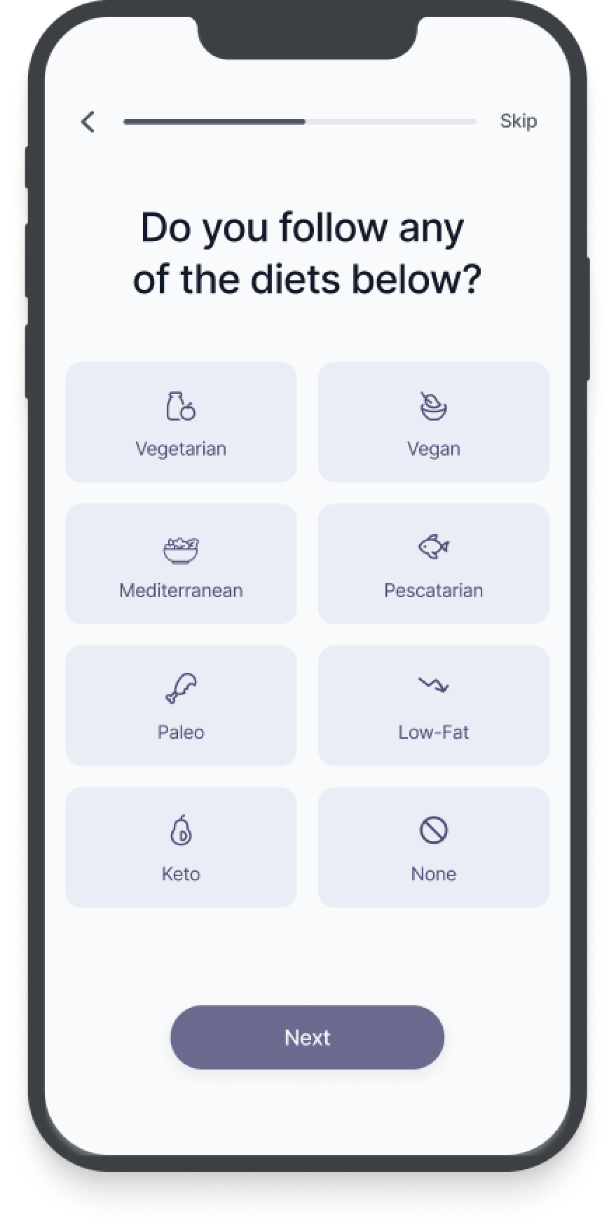
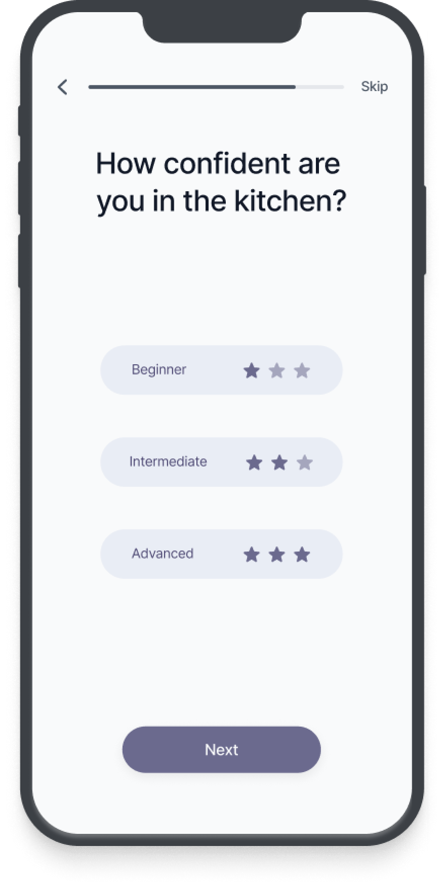
The shopping list connects directly to the user's preferred supermarket, removing the extra step between planning a meal and buying for it. Onboarding was kept just as intentional: minimal, collecting only the data with a direct impact on diet personalisation.
The goal behind every choice was simple: make cycle-based eating feel natural, not one more task to handle.



Design System
To keep the experience consistent, I built a complete UI system.

Outcomes
Usability testing identified three friction points:
- calendar navigation
- symptom logging visibility
- meal-change feedback
I resolved all through visual hierarchy and flow adjustments before final delivery, resulting in a cleaner and more confident experience. The final concept was graded 9.8/10 as part of my Bachelor's thesis.
What I learned